-MrBean-
Title: Now With Extra Baldness
Posts:
13,652
Registered:
May 23, '01
Extended Info (if available)
Real Post Cnt: 13,376
User ID: 98,822
|
Subject:
Which shot do you like better?
|
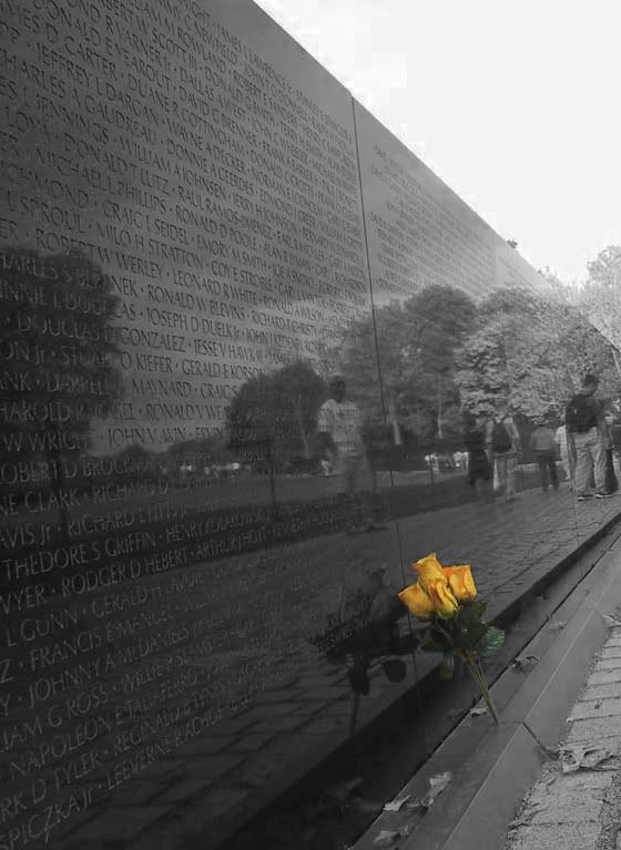
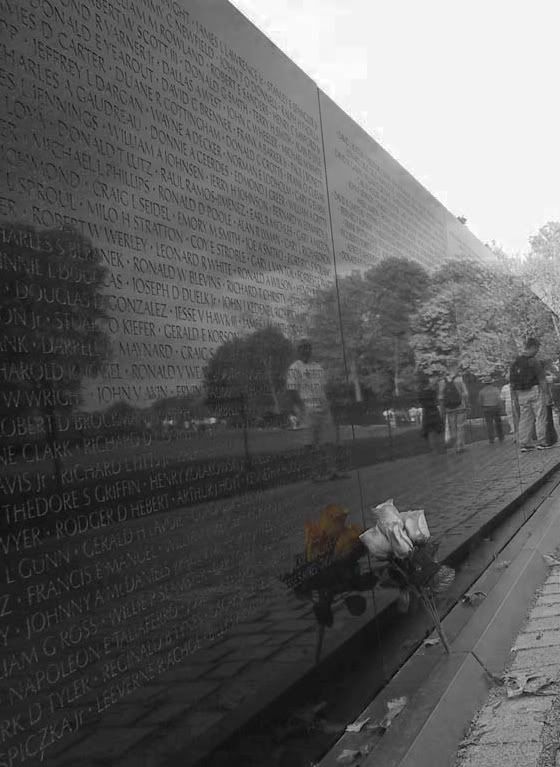
Which way do you think makes this a better photograph?
1)

2)

-----signature-----
(none)
|
|
Link to this post
|
Stiger
Title: Nerd in Training
Posts:
6,506
Registered:
Sep 2, '02
Extended Info (if available)
Real Post Cnt: 6,084
User ID: 710,825
|
Subject:
Which shot do you like better?
|
|
Hmmmm. I think I like #1 better. Why not one with the flowers and the flower reflection colored?
-----signature-----
|
|
Link to this post
|
-MrBean-
Title: Now With Extra Baldness
Posts:
13,652
Registered:
May 23, '01
Extended Info (if available)
Real Post Cnt: 13,376
User ID: 98,822
|
Subject:
Which shot do you like better?
|
Stiger posted:
Hmmmm. I think I like #1 better. Why not one with the flowers and the flower reflection colored?
Just cause when I was doing it... it just didn't seem to work that way for me, so I didn't even save it that way. And I did one of my bad things that I need to quit doing... I saved it as a flattened jpg rather than a tiff or psd with layers.
-----signature-----
(none)
|
|
Link to this post
|
Ah-Schoo
Title: Fuzzy Caterpillar of Friendliness
Posts:
71,317
Registered:
Aug 11, '00
Extended Info (if available)
Real Post Cnt: 68,974
User ID: 39,247
|
Subject:
Which shot do you like better?
|
Tough choice for me. #1 is a standard use of the technique and is beautiful. #2 is just subtle enough that it evokes a different feeling.
#2 by a hair. 
-----signature-----
.
Opinion = fact. Anecdote = proof. Political label more important than either of those.
Welcome to ACF, where debate goes to die.
.
"fascist totalitarian secular progressive Zionist intellectually challenged Christian puppets." - Aerlinthina
|
|
Link to this post
|
Morlach
Title: Aussie, Aussie, Aussie, OI! OI!! OI!!!
Posts:
12,630
Registered:
Jan 16, '02
Extended Info (if available)
Real Post Cnt: 12,263
User ID: 616,092
|
Subject:
Which shot do you like better?
|
Ah-Schoo posted:
Tough choice for me. #1 is a standard use of the technique and is beautiful. #2 is just subtle enough that it evokes a different feeling.
#2 by a hair. 
agreed
-----signature-----
"What goes up must come down. If it comes down as multiple warheads, that's even better - Jazz" HG:L http://profile.xfire.com/morlach http://www.flickr.com/photos/morlach/sets/
|
|
Link to this post
|
GhostOfACPast
Title: The Phantom Curmudgeon
Posts:
35,105
Registered:
Aug 5, '02
Extended Info (if available)
Real Post Cnt: 34,809
User ID: 703,561
|
Subject:
Which shot do you like better?
|
|
#1
-----signature-----
.\O/
...| <- Drawing of Mohammad doing jumping jacks
...|
../.\ Support freedom of expression. Aleksandr Sdvizhkov...martyr.
Parks sat so King could walk so Obama could run. Aaaaaaaammmmmmerrrrrika F••• YEAH!
|
|
Link to this post
|
Lynea
Title: Dances with Trolls
Posts:
82,344
Registered:
Jul 26, '01
Extended Info (if available)
Real Post Cnt: 80,243
User ID: 280,742
|
Subject:
Which shot do you like better?
|
#2 by a hair
It evokes a feeling the first pic does not.
-----signature-----
http://www.thebreastcancersite.com/ "It's crazy that the board newbies think I am a Liberal and B_T is a neo-con." - Gustaive_MT "God left a very clear instruction to Adam. The ****head couldn't even follow that." - -Abednego-
|
|
Link to this post
|
ShalisR
Title: Cao's Haggis Hustler
Posts:
0
Registered:
Mar 27, '02
Extended Info (if available)
Real Post Cnt: 17,133
User ID: 662,141
|
Subject:
Which shot do you like better?
|
|
Both are very good, but I really like the second one, it's beautifully subtle and as Lynea said, evocative. It looks more like "art" than the first one which is simply a great spot coloured photograph.
-----signature-----
|
|
Link to this post
|
Raiztlin
Title: Dick Tracy
Posts:
8,885
Registered:
Jan 23, '02
Extended Info (if available)
Real Post Cnt: 8,688
User ID: 626,780
|
Subject:
Which shot do you like better?
|
I like #2 best, and even though you didn't really ask for any CC, I'm gonna give it to you anyway ;D
I like the photo alot. Even I, a norwegian, have seen this motif many many times, but you manage to bring some orginality to it, which is something of a feat on a well used motif like this. Good job!
I also like the composition, showing off the people there without actually shooting them, making them a very nice piece of the background and keeping the focus where it should be.
converging lines as the stone and pavement thingy there forms are almost always a good thing, helping to draw the viewer further into the image.
The one negative thing I have to say, is that it is crooked. there are alot of lines in the image, and not a single one is straight. for me it's a bit irritating. I'd probably crop it some just to get the vertical lines straight, like so:

-----signature-----
I has a flavor!
CC always welcome.
|
|
Link to this post
|
Shriva_al-Destroyer
Posts:
11,205
Registered:
Jul 3, '01
Extended Info (if available)
Real Post Cnt: 11,018
User ID: 220,115
|
Subject:
Which shot do you like better?
|
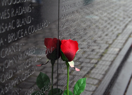
Very nice! I did something like this shot last year when i was there.. Its very moving being there isn't it?
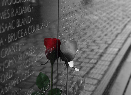
Heres mine from march 08..

And someone commented that i should try coloing the reflection..hehe

I really should have picked some real flowers to do it with instead of the plastic one.. but there was a TON of people there at the time and i couldn't backup at all without having them all in the shot..
I really like yours from futher back though!
-----signature-----
Cry "Havoc!"and let loose the dogs of Photography! Check out the Photography Board @ http://vnboards.ign.com/cb_photography/b23057/p1 http://www.flickr.com/photos/j0dann/
|
|
Link to this post
|
Lynea
Title: Dances with Trolls
Posts:
82,344
Registered:
Jul 26, '01
Extended Info (if available)
Real Post Cnt: 80,243
User ID: 280,742
|
Subject:
Which shot do you like better?
|
Raiztlin posted:
The one negative thing I have to say, is that it is crooked. there are alot of lines in the image, and not a single one is straight. for me it's a bit irritating. I'd probably crop it some just to get the vertical lines straight, like so:

I didn't even notice it was crooked until you said something. I like your crop better.
-----signature-----
http://www.thebreastcancersite.com/ "It's crazy that the board newbies think I am a Liberal and B_T is a neo-con." - Gustaive_MT "God left a very clear instruction to Adam. The ****head couldn't even follow that." - -Abednego-
|
|
Link to this post
|
Manesero
Posts:
10,209
Registered:
Dec 21, '01
Extended Info (if available)
Real Post Cnt: 10,058
User ID: 568,786
|
Subject:
Which shot do you like better?
|
here's an idea.
What if you were to make the entire wall as if it were normal colour, and then make the rest of the picture black/white. Kinda like representing the contrast of the living/dead concept.
-----signature-----
|
|
Link to this post
|
-MrBean-
Title: Now With Extra Baldness
Posts:
13,652
Registered:
May 23, '01
Extended Info (if available)
Real Post Cnt: 13,376
User ID: 98,822
|
Subject:
Which shot do you like better?
|
Manesero posted:
here's an idea.
What if you were to make the entire wall as if it were normal colour, and then make the rest of the picture black/white. Kinda like representing the contrast of the living/dead concept.
Would be worth a shot to try... cept the wall is grey and white itself.
-----signature-----
(none)
|
|
Link to this post
|
Manesero
Posts:
10,209
Registered:
Dec 21, '01
Extended Info (if available)
Real Post Cnt: 10,058
User ID: 568,786
|
Subject:
Which shot do you like better?
|
|
or everything black and white, but all the reflections in the wall have their colour.
-----signature-----
|
|
Link to this post
|